This article explores California’s wastewater and biosolids PFAS data, comparing it to national studies and utilizing artificial intelligence (AI) tools for source analysis investigation.
Poly- and perfluoroalkyl substances (PFAS) are a critical class of contaminants due to their widespread presence in the environment and evidence of impacts on human health. Studies have linked certain PFAS to liver disease, immune system dysfunction, increased risk of kidney cancer, developmental issues in fetuses, and elevated cholesterol levels. The EPA has determined that over 1,400 PFAS have been manufactured or utilized in the U.S. since 2011. High levels of PFAS can enter wastewater from point sources, but trace amounts are consistently detected even in domestic wastewater and biosolids. Key properties of PFAS, such as their toxicity and absorption in biosolids, depend on their chain length or the number of carbon atoms.
Two PFAS known for their toxicity, perfluorooctanoic acid (PFOA) and perfluorooctane sulfonate (PFOS), have been phased out in the U.S. since 2015. PFOA, PFOS, and perfluorohexane sulfonic acid (PFHxS) are also banned internationally under the Stockholm Convention. Furthermore, sixteen states have prohibited PFAS in at least some products. These phaseouts have led to a decline in long-chain PFAS in wastewater effluent over time.
Consistent and widespread detections persist, including outliers likely originating from point sources. Landfill leachate remains a continuous source of PFAS to sewer systems. Legacy sites such as airports may also serve as ongoing sources if previously spilled PFAS enters sewers through inflow and infiltration. 1
To enhance the understanding of PFAS in wastewater, the State Water Board of California issued investigative orders to test 31 PFAS in the influent, effluent, and biosolids of Publicly Owned Treatment Works (POTWs) in 2020. Under this order, POTWs with a flow greater than 5 MGD were required to sample the influent, effluent, and biosolids quarterly for one year. POTWs with flows between 1 and 5 MGD also sampled influent and effluent quarterly, but biosolids only once. This data is now publicly accessible through the California Geotracker website. 2
California’s Geotracker is the largest wastewater and biosolids PFAS database available, and there is much to learn from this information. Below, we calculated the detection frequencies of the most prevalent PFAS and compared them with drinking water, evaluated the partitioning of the chemicals between effluent and biosolids, examined the differences in influent and effluent values of major PFAS, investigated seasonal changes in PFAS concentrations, and performed an AI clustering analysis of the data for clues about sources.
The data analysis was conducted using Python packages such as Pandas, NumPy, and Scikit-learn for data processing. For plotting, we utilized Matplotlib, Seaborn, Folium, and Plotly. No individual PFAS were detected in 100% of samples, requiring assumptions to be made about PFAS below detection for data analysis. If the value was less than or equal to the method detection limit (MDL), we assumed the value to be half the MDL. If the value was between the minimum reporting limit (MRL) and MDL (referred to as a “J-value”), it was retained as the best estimate value. If the value was reported as equal to the MRL but paired with “<” or “ND” (not detected) in the qualifier column, it was replaced with half of the MRL.
The detection frequency was established for each sample type, namely influent, effluent, and biosolids. Detection frequencies were compared between the effluent in the California PFAS database and national drinking water based on the Fifth Unregulated Contaminant Monitoring Rule (UCMR5). UCMR5 collects national drinking water PFAS data (2023-present.) Available UCMR5 data was downloaded in June 2024 and included data from 66% of U.S. drinking water systems serving over 3,300 people. Detection frequencies below 0.1% were not displayed.
Other statistics were calculated only for PFAS with a detection frequency of at least 50% in each relevant sample type. Within each facility, medians were initially calculated across the quarterly samples before determining ratios or differences. Outliers were defined as being 1.5 times the interquartile range above the 75th percentile or below the 25th percentile.
To compare the seasonal trends in the effluent and biosolids, the samples were divided into four seasons based on the sampling date. The seasons were plotted by chemical and compared after removing the outliers. An analysis of variance (ANOVA) was performed to determine if there was a seasonal trend.
Data clustering algorithms are a part of a family of AI tools known as unsupervised machine learning. These tools discover emergent patterns in data without requiring labels such as “domestic” or “landfill.” For the AI clustering analysis, both the density-based spatial clustering of applications with noise (DBSCAN) and K-means clustering algorithms were utilized to analyze trends in biosolids concentrations. The outliers were removed using z-score, and the data was scaled using the Normalizer scalar in Python’s Scikit Learn. The hyperparameters were selected based on the optimal silhouette score for the analysis. The feature importance of each cluster was plotted and analyzed.
The closest landfill or airport to each WWTP was determined by geodesic distance. The landfills and airports were estimated to discharge to the nearest WWTP. Therefore, for WWTPs in each AI cluster, the number of closest landfills and airports was counted and compared. Landfills were identified using the EPA’s Landfill Methane Outreach Program database. The identified airports were required to train personnel in aqueous film-forming foams (i.e., PFAS-based firefighting foams) according to Title 14 of the Code of Federal Regulations.
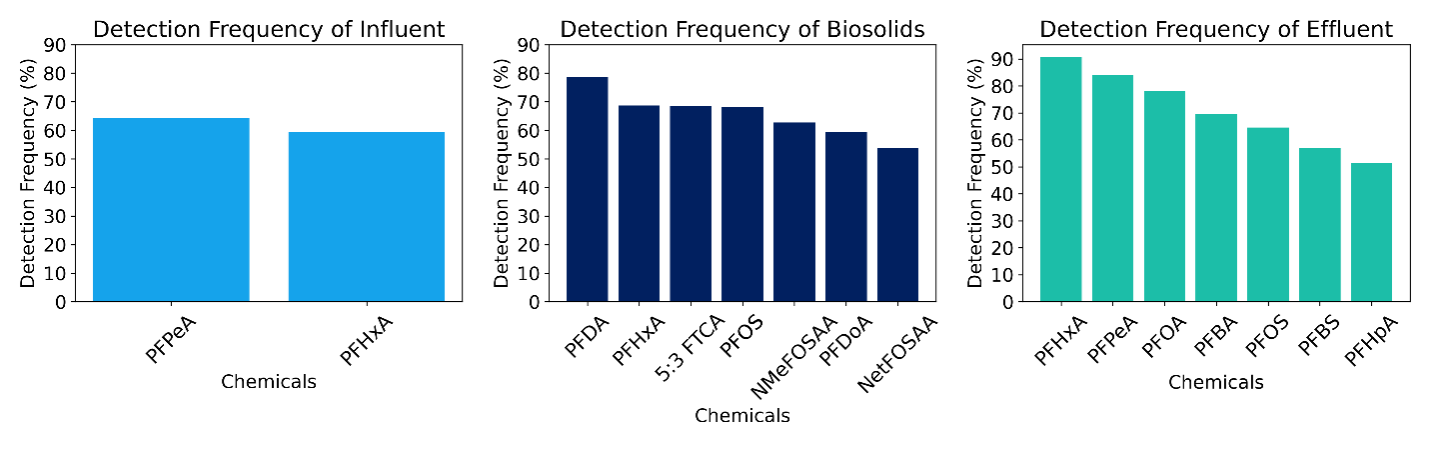
Figure 1. PFAS detection frequencies in influent, biosolids, and effluent. Only PFAS with >50% detection frequency is shown.
In the influent, only short-chain PFAS, perfluoropentanoic acid (PFPeA), and perfluorohexanoic acid (PFHxA) were detected in over 50% of samples (Figure 1). PFHxA and PFPeA were also the most frequently detected in the effluent, but additional PFAS had detection frequencies exceeding 50%, including PFOA, perfluorobutanoic acid (PFBA), PFOS, perfluorobutane sulfonic acid (PFBS), and perfluorooctanoic acid (PFHpA). Increased detection frequencies in the effluent are driven by both lower detection limits and the biological transformation of PFAS across the WWTPs (see Section 3.3)
For the biosolids, the most frequently detected compound was perfluorodecanoic acid (PFDA), which is a long-chain PFAS. This makes sense since long-chain PFAS tend to partition more into biosolids (see Section 3.2). Additionally, there was a relatively frequent detection of 5:3 fluorotelomer carboxylic acid (5:3 FTCA), a polyfluoroalkyl substance that can biotransform from other polyfluoroalkyl substances, such as 6:2 fluorotelomer alcohol (6:2 FTOH) (Merino et al., 2023). 5:3 FTCA exhibited the highest average concentration in biosolids within the national data collected for the WRF Project #5031. 3
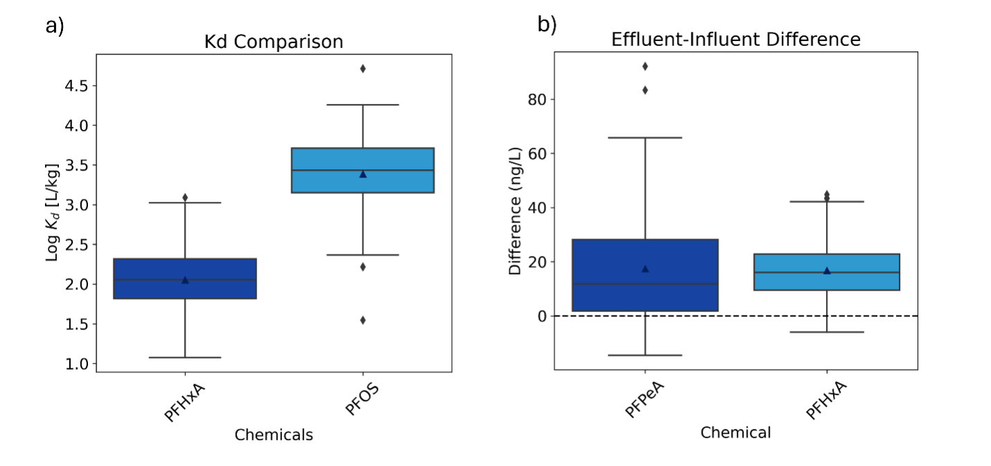
Figure 2. a) Comparison of the Kd of a short-chain and a long-chain PFAS. b) Plotting the difference between the effluent and the influent. Some outliers are not shown.
The partitioning coefficient (Kd) represents the concentration ratio of PFAS in biosolids to that in water. A higher Kd indicates a greater affinity for solids. Although there was significant site-to-site variability, the median Kd for the short-chain PFHxA was 112 L kg-1, and for the long-chain PFOS, the median Kd was notably higher at 2691 L kg-1 (Figure 2a). These Kd values align with findings from previous studies. The hydrophobicity of longer chain PFAS drives their increased affinity for biosolids. 4
PFPeA and PFHxA were 15.2 ng/L and 13.9 ng/L higher in the effluent than in the influent, respectively (Figure 2b). Research has shown that the concentrations of certain PFAS can increase due to the biotransformation of polyfluoroalkyl precursor compounds. For instance, PFOA rose by an average of 6 ng/L in a national meta-analysis 1
In Figure 3, the detection frequency in the UCMR5 drinking water database is compared with that in the California wastewater database. Detection frequencies in wastewater effluent were generally higher. Nonetheless, the trend of the detection frequencies closely aligns, with the short-chain PFHxA and PFPeA being the most detected in both databases. This could indicate de facto reuse as a widespread source of PFAS in drinking water (Islam et al., 2023). However, it could also suggest that 6:2 fluorotelomer polyfluoroalkyl substances are biodegrading to PFPeA and PFHxA in both wastewater treatment processes and the environment. 5
Figure 3. Correlation between the detection frequency in the UCRM5 drinking water database and California wastewater database. The blue line is the linear regression, and the shaded blue area is its 95% confidence band.
In the effluent, the strongest seasonal variation was observed in PFPeA and PFBA (Figure 4). These are both short-chain PFAS that could increase due to faster biotransformation of precursors at higher temperatures in the summer. PFPeA showed a similar seasonal pattern for a single WWTP with a high sample size in a previous study. 1
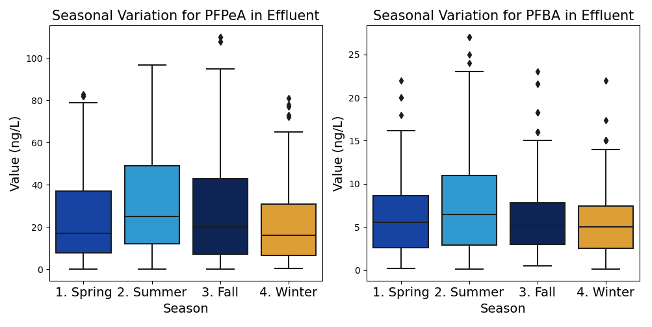
Figure 4. Seasonal variation in PFAS in effluent of two chemical species with the lowest p-value (both lower than 0.01).
A clustering analysis was conducted on the concentration of PFAS with a detection frequency greater than 50% in the biosolids. The algorithms identified three clusters in the data. Cluster 1 was characterized by predominant levels of 5:3 FTCA (Figure 5, Figure 6). In Cluster 1, 60% of the PFAS detected in the biosolids were 5:3 FTCA, as shown in Figure 6. The average concentration of 5:3 FTCA in Cluster 1 is 52.5 ppb, compared to 0.7 ppb and 1.4 ppb in Clusters 0 and 2, respectively. Cluster 0 had relatively high levels of other polyfluoroalkyl substances, specifically N-methylperfluorooctanesulfonamidoacetic acid (N-MeFOSAA) and N-ethylperfluorooctanesulfonamidoacetic acid (N-EtFOSAA). Cluster 2 exhibited high levels of long-chain perfluoroalkyl acids, including PFOS and PFDA.

Figure 5. Principal Component Analysis biplot.

Figure 6. Importance of each variable in each cluster for biosolids.
To investigate which sources might contribute to biosolids’ PFAS signatures falling into these clusters, we compared the number of nearby landfills and airports. WWTPs in Cluster 1 had an average of 1.9 landfills closest to them, compared to an average of 1.6 landfills for Clusters 0 and 2. This result was anticipated since 5:3 FTCA had the highest average concentration in leachate in a survey of 18 U.S. landfills (Lang et al., 2017). Thus, this clustering analysis supports the notion that above-average 5:3 FTCA in biosolids indicates PFAS contamination stemming from landfills. Cluster 2 had the highest average number of nearest airports, but only marginally compared to Cluster 1, so a definitive fingerprint for airport contamination was not confirmed.

Table 1. Number of Landfills and Airports nearest to Californian WWTPs in each data cluster
Let’s conclude this article with some good news. By merging the California wastewater effluent data with the earlier national meta-analysis i, we observe a significant downward trend over time for long-chain PFAS. PFOA and PFOS are decreasing by about 9% and 7% per year, respectively. These trends seem to confirm the positive impact of source control and the phasing out of non-essential PFAS from products. Although some short-chain PFAS have been increasing, they are considered less toxic. Time will reveal whether their concentrations level off or decline in response to broader PFAS phaseouts.
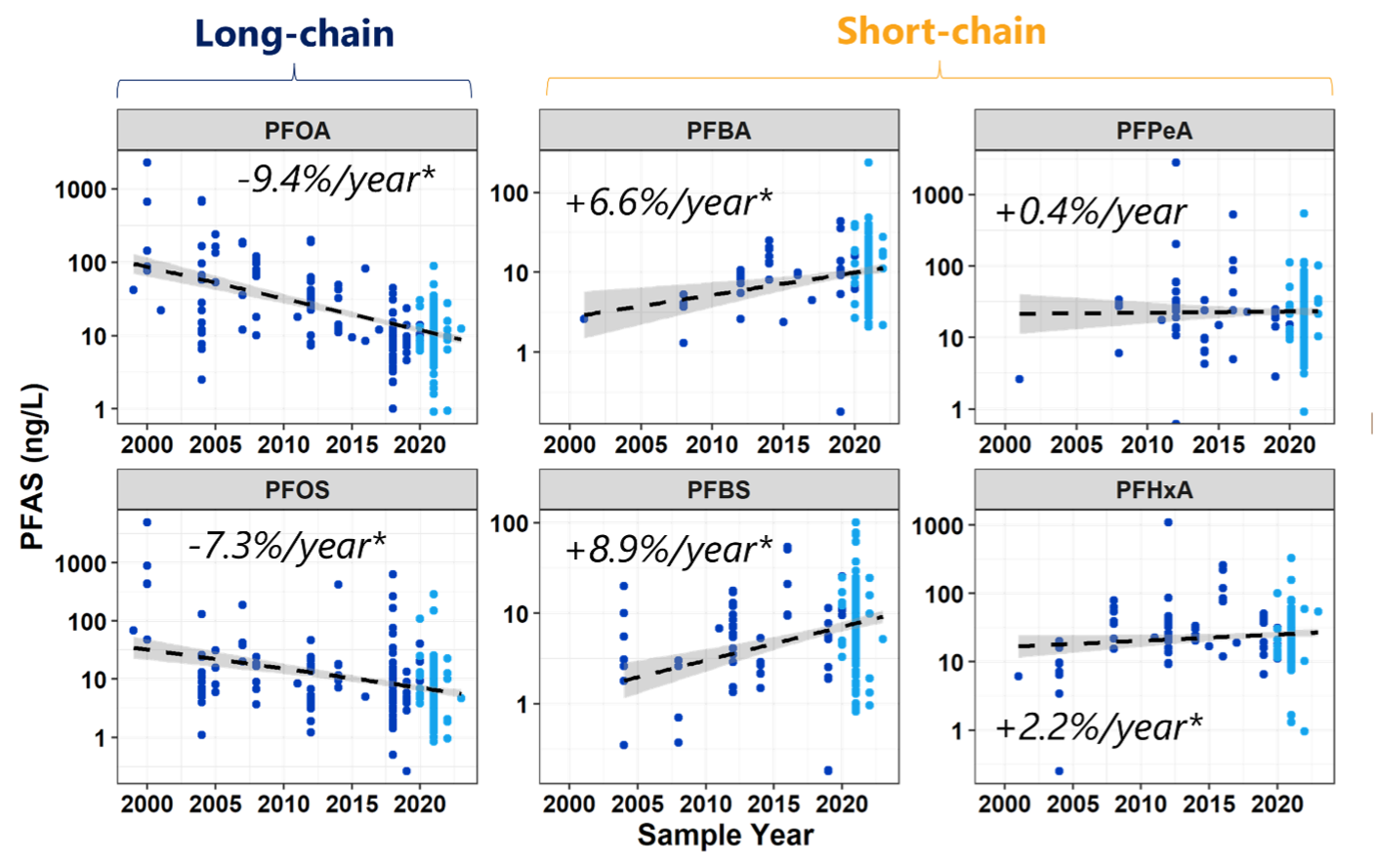
Figure 7. Concentration vs. sample year for PFAS in effluent in the California Geotracker database (light blue) and a national meta-analysis (dark blue). Asterisks (*) indicate statistically significant correlations with time.
1. Thompson et al., 2022↩
2. https://geotracker.waterboards.ca.gov/map/pfas_map↩
3. Schaefer et al, 2024↩
4: McKenzie et. al, 2023↩
5. Gonzalez et al., 2021; Harding-Marjanovic et al., 2015↩
For the references used in this study, contact [email protected]